Raptors TwoFive
Client: MLSE (Toronto Raptors)
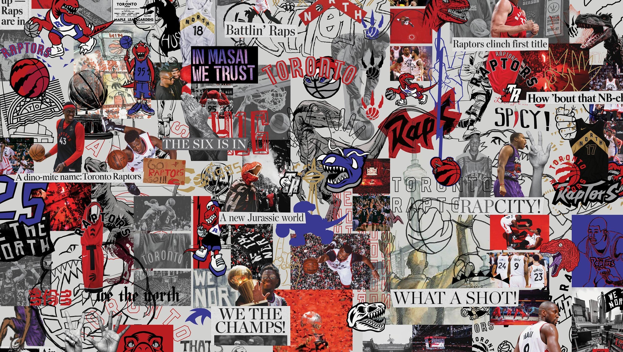
When the Raptors came to Toronto in ’95, we were a basketball team playing in a baseball stadium, in a hockey town. But everything changed when Lowry lifted the Larry O’Brien.
With the 25th anniversary following a historic year, we knew a generic anniversary logo wouldn’t cut it. They all looked and felt the same — and The North is anything but. TwoFive pays homage to the fans who’ve repped their team and city from day one. They built The North with every fist bump, high five, three-point wave, and 6 God prayer.


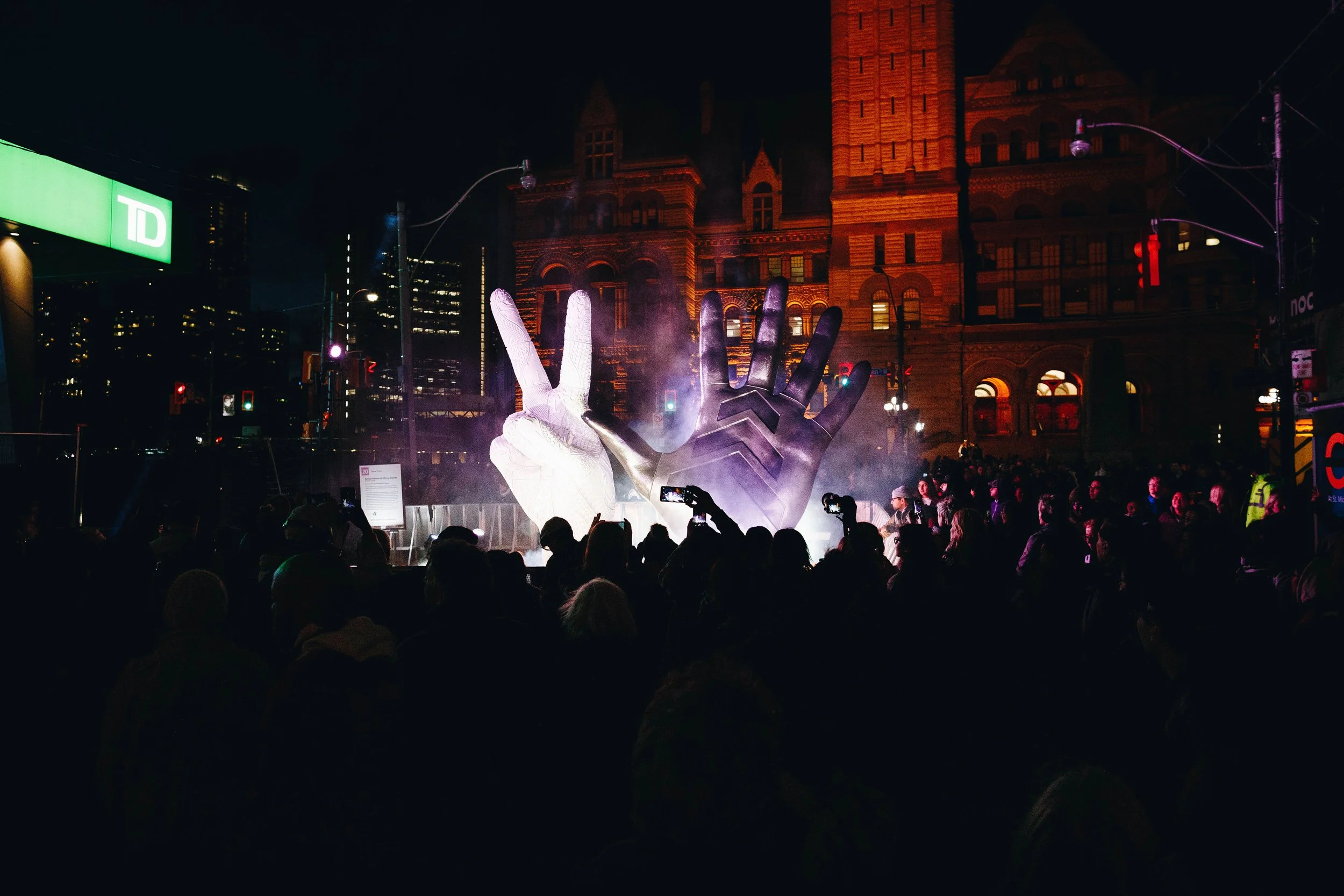

The Raptors salute their fans with a
monument at Nuit Blanche
— Now —
CREDITS :: SID LEE
ECD: Jeffrey DaSilva
CD: Kim Tarlo
CD (DESIGN): Laura Stein
ACD (DESIGN): Alex Boland
ART DIRECTOR: Sam Heichert
COPYWRITER: Sean Ngo
PRODUCER: Ashley Chu
MLSE
CD: Kevin Mones
ART DIRECTOR: Caroline Shaw
DESIGNER: Anthony Laksmana, Bianca Naje, Travis Champagne